Showing posts with label MY WORK. Show all posts

Sunday, August 11, 2013

Final Packaging Designs


TAH DAH! 

My final designs for our exhibition on branding and packaging. 

Above photo shows the final ink scroll I made for the gatefold sleeve. I think this paper print is much stronger than my earlier attempts, and suits my brothers style of music more, less 'manic' by relying on two central tones apposed to three. 
Plus I think it's purdy! 

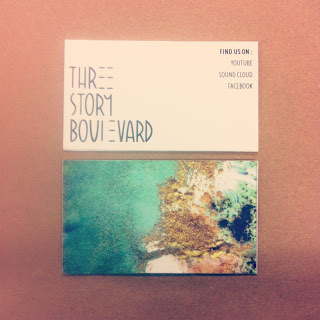
The bottom one shows my space in our final exhibition, displaying my record sleeve as well as a pack of the business cards I created to compliment it.

Now all I have to do is wait for my brother to record his band's album..


Tuesday, July 23, 2013

Three Story Boulevard Vinyl - As of Now

I started today by making a digital version of my logo for the band. Below is my final composition, after taking into account the feedback I got from this afternoon's crit - tampering with the letters U, Y and D.


I then began to experiment with the ink photos from yesterday.
Originally, my design had one copy of a manipulated photograph, underneath the above logo in white. However after printing it out, taking a break and having a Snapple, I could see that it wasn't right. So played around further, mirroring and rotating the images (four to a page) to create a more symmetrical and abstract composition.

The design on the left showed the text sitting on top of a translucent black box with a thin, white trim. The centre one without one, and the left showing a strectched black box and border. My favourite by far was the black square with thin white boarder, it just works for me!


Below are my designs at the end of a long Tuesday. The top showing the outside of the sleeve, showing the bands names on the front, wrapping the design around the back to show the tracklist. Both contained by black translucent boxes as well as a separate white boarder. 

Below shows my design for the inside the inside of the album cover, folding out into a mirrored design of another inky creation, with general band/album information. Again contained within and black box, however without the white trim - I thought i was too fussy!


I will see my designs in the light of day and continue to tweak, as well generate an appropriate business card. 

I'm really loving this project, finally getting my teeth into it!!

Monday, July 22, 2013

Inks and Fairy Glitter


FINALLY! I have decided the route of my branding project (a little late I'm aware, indecisiveness under pressure is a fall-back of mine) but I am very excited to pursue the design for a vinyl cover.

I have decided to work with my brother's band, using this opportunity to create something professional and to have fun it! His band is called Three Story Boulevard, being that there are three members of the band - Sam, James and Tom. The band's sound is in it's early stages, but focuses on a soft rock and acoustic element. 

I first played around with the bands 'logo' and whitteled it down to my two favourite designs. However I think that the design on the left is nice, but has too much personality, were the one on the right may give me more scope creatively. 


I knew that I wanted to work with photographic and textural elements, instead of creating something off Illustrator. So to play with this idea I went out and bought a bunch of dry fabric inks in the shades Aqua Marine, Fuchsia and Solar Gold. I had a whale of a time sprinkling, dripping, splashing and photographing these inks. Hopefully I have generated enough material for me to work with, using photoshop to layer and adjust to make textural graphics to combine with my text.


Sunday, July 21, 2013

Team Williamsburg


 As a group we decided the place where we wanted to explore and develop a logo for was Williamsburg, Brooklyn.


We spent the first two hours wandering (shopping) around Bedford av. to try and soak up the energy of the place. 

It was calmer than Manhattan, more peaceful with local produce a key influence. Quaint but creative. So we decided to have a mutual starting point, the letters WB-BK, and see what each of could come up with overnight. 


Here are a couple of pages from my sketchbook. I took inspiration from the 'FOOLS GOLD' font for my ideas, focusing on the mirrored 'B' and circle composition as a starting point.


Everyone went and developed there own ideas, so we stuck up all of our options and had our own crit. Talking about which designs we liked, or any particular elements within those designs. How to combine or develop them so that everyone was content that we had a strong design. It was whittled down to the bottom design, debating wether we should include the dots around the leaves or not. As we were torn I asked the class and the unanimous vote went to the 'no dots' option. 


So here is our final design.

It stemmed from one of my sketches but I think that everyone contributed to tweak and discuss what was and wasn't successful, as well as giving elements to group members with better computer skills to edit the final design. 

Our logo is designed to work on the side of a tote bag, both in solid black ink, but offers the opportunity to play with marbled colours, as it is a simple block design.

Wednesday, July 17, 2013

Book Cover Design // BORGES


Above is my final design for the book cover of Borges' 'Library of Babel'.

From the beginning I knew that I wanted to work with the hexagon form. The library which Borges describes is hexagonal, a maze of rooms interlocking and infinite.

I played around in illustrator with hexagons, trying not to make the cover simple but not boring. I didn't want to work with photo, feeling that the contents of the book is not about a physical library, therefore there should be no visual reference to one. 

I like the combination of colour for the spine, the choice of font and the fact that the pattern is incomplete in particular areas. I feel it helps to bring the contained theories into the present day. 

(Below - less successful designs abandoned on route to greatness..)

My Book - TAH DAH!


FINALLY! After all the printing drama and obstacles along the way, 
I have put together my book.

Originally I wasn't sure how the pages would work together as I designed them as separate sheets, but I think this way was the best way to add movement through the pages. The lyrics flow down the pages, tying with the imagery, eleven in total.

Well chuffed with the outcome.


Sunday, July 14, 2013

The Progression of my Own Book


 When introduced to the task of making a book in a week, I can't deny I was daunted. Having never been a fix at anything technological, I worried that a lack of knowledge would stem my creative progression (as it has in the past). Luckily after a few intensive projects I felt more at ease with the software, and ended up relying on it to generate my own book.

The text which I used were lyrics taken from the Gaslight Anthem's song 'Handwritten'. I did consider changing text to an extract from my favourite book (Oscar Wilde's Tale of Dorian Grey) to allow more breathing room for the project. But I found myself hooked to a single line: I'm in love with the way you're in love with the night.


This set me off experimenting with light painting around my local area. I love New York at night. The energy peaks as the sun goes down (very different to where I live in England, the nearest town is 30 minutes away). The sounds and smells and lights intrigued me, and was the route I went down for my photography.

Once I has the text and pictures sorted the game really started, as I played with layout - the relationship between text and image to convey the type of message I was putting across. 

To me, the lyrics almost sound like a mental monologue, confessional even, which is why I kept my photos very abstract and without faces. I just want there to be a beautiful harmony between these two elements, while incorporating grey faded boxes to frame the text to add a recurring element throughout the book.

Having been slow on the printing front I haven't yet got a physical version. however I am aiming to have a sort of vertical accordion book, a folded scroll which will slot into some sort of envelope or box...

Can't wait to see the end result!


Wednesday, July 10, 2013

Book Design


(sketchbook work)

Our assignment for this week involves generating a book out of thin air. The main objective is to play with the relationship between text and image, including such creative elements as text, photography, textures, typography, page layout and book making.

My book stems from the song 'Handwritten' by The Gaslight Anthem, particularly this lyric

I'M IN LOVE WITH THE WAY YOU'RE IN LOVE WITH THE NIGHT

I just think it's very beautiful, and inspired me to roam my local neighbourhood at night taking photos which I could then work with. I ended up doing a lot of light painting, having a longer shutter speed and experimenting by 'giggeling' the camera.


I then played with editing a couple of these photos and then incorporating them into some prototype pages. The result of one direction below.


I'm still not entirely sure which direction my book will take, I'm more drawn to idea of having as landscape orientated pamphlet book or a series of placards, then placed in a display box.. Lot's of work to do!

Monday, July 8, 2013

Sculptural Typography.. with sponges.


Ah Bed, Bath and Beyhond..  not a place which usually answers my prayers. However last weekend it did, as I did not relaise how painful it would be to locate sponges in New York. Never the less I took to massacring them to create the word 'YOUTH', in the same font from our digital based typography work. For me, the colour, texture and context of this medium fitted perfectly with the meaning of my chosen word. 

I had planned to balance these sponges on top of the bubbles. However cut short when I realised that the sponges would absorb, weighing them down to the surface of the water.. obvious I know, but at that moment practictality slipped my tired brain.


Above was my final composition. For the top photo I merely crouched to the surface of the water to achieve the right angle, then tampered with exposure and other photoshop elements to achieve a more suitable hue.

For the below 'comic-strip' like series I unplugged the bath and let the water drain, taking a photo (the camera static) every ten seconds - Tah Dah!  

Sunday, July 7, 2013

Gestalt and The Scroll.


After an introduction to the idea of Gestalt Theory, as a class we were assigned to generate a black and white version of our own symbolic representation of one of the following; grow, danger or unity

Being awkward I chose to work with the concept of unity, pulling on the infamous Ying Yang icon as my inspirational base. The following icon was developed using Illustrator C6. 
Then, using these silhouettes, we were to create figure-ground compositions - a concept which took a few moments to process.. one which was stable composition with white icons and a black backgroun. One stable composition with black icons and a white background, and one ambiguous or reversible composition. 

Finally for this project, we were to make a scroll combining these three compositions which had a transition in figure-ground. The second image shows my final scroll, tweaked after our crit.

FACT: Die Gestalt is a German word for form or shape. It is used in English to refer to a concept of 'wholeness'

Saturday, July 6, 2013

The Grand Finale


Tah dah! Here are my final designs which were displayed in the exhibition.

Above are the business cards, front and back, using the same paper design from the sleeve as well as basic information about sites to find my brother's band on.

The second photo shows my final display. I feel that this design is much more suited to the band's sound, it is not as psychedelic as the previous patterns and 'calmed down' due to the use of two colours apposed to my earlier drafts.

I'm chuffed with my final edits and hope that my brother will be too!